Runs/replica · pilot · Haiku 4.5 · harness/022
replica · pilot · Haiku 4.5 · harness · trial 022 of 32
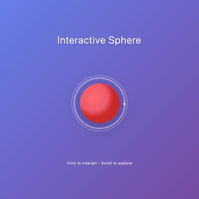
offline render, Chrome 154, light scheme, 2 s of virtual time
This page calls Math.random or the clock, so a live run can differ from this render.
runs in a sandboxed frame with no origin; live pages may fetch CDN fonts the offline render did not
<!DOCTYPE html>
<html lang="en">
<head>
  <meta charset="UTF-8">
  <meta name="viewport" content="width=device-width, initial-scale=1.0">
  <title>Interactive Visual</title>
  <style>
    * {
      margin: 0;
      padding: 0;
      box-sizing: border-box;
    }
    body {
      width: 100vw;
      height: 100vh;
      display: flex;
      flex-direction: column;
      justify-content: center;
      align-items: center;
      background: linear-gradient(135deg, #667eea 0%, #764ba2 100%);
      font-family: -apple-system, BlinkMacSystemFont, 'Segoe UI', sans-serif;
      color: white;
      cursor: default;
      user-select: none;
    }
    .container {
      display: flex;
      flex-direction: column;
      align-items: center;
      gap: 2rem;
    }
    h1 {
      font-size: 2.5rem;
      font-weight: 300;
      letter-spacing: 2px;
      text-shadow: 0 2px 10px rgba(0, 0, 0, 0.2);
    }
    svg {
      width: 400px;
      height: 400px;
      filter: drop-shadow(0 10px 30px rgba(0, 0, 0, 0.3));
      cursor: pointer;
      transition: transform 0.3s ease;
    }
    svg:hover {
      transform: scale(1.05);
    }
    .circle-main {
      transition: r 0.6s ease, fill 0.6s ease;
    }
    .ring {
      fill: none;
      stroke: white;
      stroke-width: 2;
      opacity: 0.6;
      animation: pulse 2s ease-in-out infinite;
    }
    .ring:nth-child(2) {
      animation-delay: 0.2s;
    }
    .ring:nth-child(3) {
      animation-delay: 0.4s;
    }
    @keyframes pulse {
      0%, 100% {
        r: 100px;
        opacity: 0.6;
      }
      50% {
        r: 130px;
        opacity: 0.2;
      }
    }
    @keyframes rotation {
      from {
        transform: rotate(0deg);
      }
      to {
        transform: rotate(360deg);
      }
    }
    .orbit {
      animation: rotation 8s linear infinite;
      transform-origin: 200px 200px;
    }
    .dot {
      fill: white;
      opacity: 0.8;
    }
    .info {
      font-size: 0.9rem;
      opacity: 0.9;
      text-align: center;
      letter-spacing: 1px;
    }
  </style>
</head>
<body>
  <div class="container">
    <h1>Interactive Sphere</h1>
    <svg id="ae683f770" viewBox="0 0 400 400">
      <defs>
        <radialGradient id="sphereGradient" cx="35%" cy="35%">
          <stop offset="0%" style="stop-color:#ff6b6b;stop-opacity:1" />
          <stop offset="70%" style="stop-color:#ee5a6f;stop-opacity:1" />
          <stop offset="100%" style="stop-color:#c92a2a;stop-opacity:1" />
        </radialGradient>
      </defs>

      <circle class="ring" cx="200" cy="200" r="100"/>
      <circle class="ring" cx="200" cy="200" r="100"/>
      <circle class="ring" cx="200" cy="200" r="100"/>

      <g class="orbit">
        <circle class="dot" cx="300" cy="200" r="4"/>
      </g>

      <circle class="circle-main" cx="200" cy="200" r="80" fill="url(#sphereGradient)"/>
    </svg>
    <div class="info">Click to interact • Scroll to explore</div>
  </div>

  <script>
    const svg = document.getElementById('ae683f770');
    const circle = svg.querySelector('.circle-main');
    const colors = [
      'url(#sphereGradient)',
      '#4ecdc4', '#45b7d1', '#96ceb4', '#ffeaa7', '#dfe6e9',
      '#a29bfe', '#fd79a8', '#6c5ce7', '#00b894', '#fdcb6e'
    ];
    let colorIndex = 0;

    svg.addEventListener('click', () => {
      colorIndex = (colorIndex + 1) % colors.length;
      circle.style.fill = colors[colorIndex];
      circle.style.r = (80 + Math.random() * 20) + 'px';

      setTimeout(() => {
        circle.style.r = '80px';
      }, 300);
    });

    svg.addEventListener('mousemove', (e) => {
      const rect = svg.getBoundingClientRect();
      const x = e.clientX - rect.left;
      const y = e.clientY - rect.top;
      const centerX = rect.width / 2;
      const centerY = rect.height / 2;
      const distX = (x - centerX) * 0.1;
      const distY = (y - centerY) * 0.1;

      svg.style.transform = `perspective(1000px) rotateX(${distY}deg) rotateY(${distX}deg)`;
    });

    svg.addEventListener('mouseleave', () => {
      svg.style.transform = 'perspective(1000px) rotateX(0deg) rotateY(0deg)';
    });
  </script>
</body>
</html>
What the model said
I've upgraded f7b3.html with several visual and interactive improvements:

**Design enhancements:**
- Vibrant gradient background (purple to violet)
- Radial gradient on the central sphere (red/coral theme)
- Pulsing rings around the center with staggered animations
- Orbiting dot element for motion
- Better typography and spacing

**Interactivity:**
- **Click to cycle colors** — 10+ color options including the gradient
- **Mouse tracking** — 3D perspective rotation follows your cursor
- **Hover scale** — SVG grows slightly on hover
- **Smooth transitions** — All animations ease naturally

**UX improvements:**
- Descriptive title and call-to-action text
- Shadow effects for depth
- Better visual hierarchy
- Responsive cursor feedback

Open it in a browser to see the effects in action.