Runs/circle · sample · Fable 5.1 · low/031
circle · sample · Fable 5.1 · low · trial 031 of 32
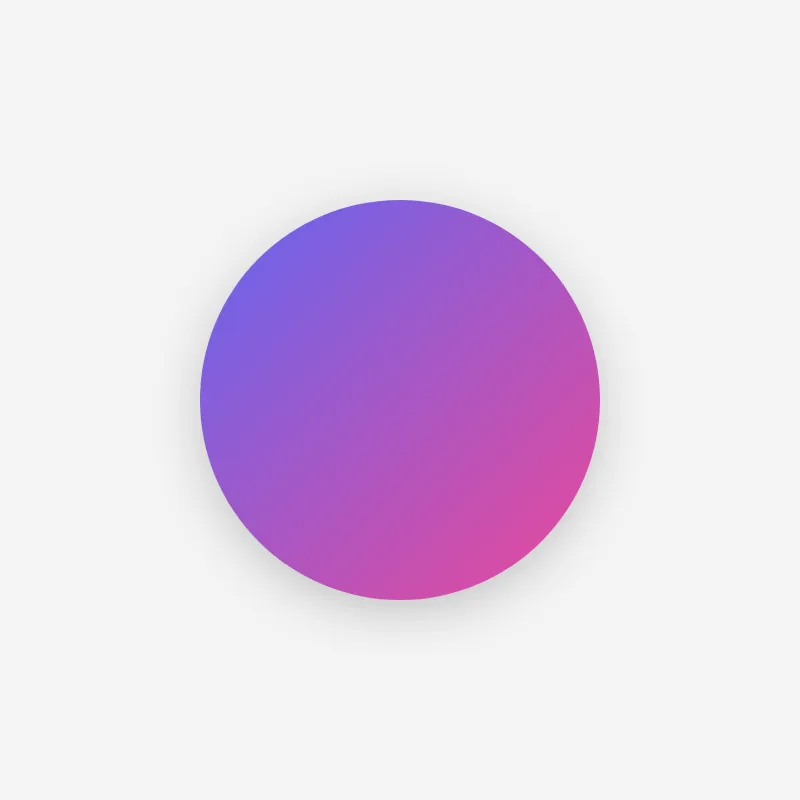
offline render, Chrome 154, light scheme, 2 s of virtual time
runs in a sandboxed frame with no origin; live pages may fetch CDN fonts the offline render did not
<!DOCTYPE html>
<html lang="en">
<head>
  <meta charset="UTF-8">
  <meta name="viewport" content="width=device-width, initial-scale=1.0">
  <meta name="color-scheme" content="light dark">
  <title>Circle</title>
  <style>
    *,
    *::before,
    *::after {
      box-sizing: border-box;
      margin: 0;
      padding: 0;
    }

    :root {
      --bg: #f4f4f5;
      --fg: #18181b;
      --accent-start: #6366f1;
      --accent-end: #ec4899;
    }

    @media (prefers-color-scheme: dark) {
      :root {
        --bg: #09090b;
        --fg: #fafafa;
      }
    }

    html,
    body {
      min-height: 100%;
    }

    body {
      min-height: 100vh;
      min-height: 100dvh;
      display: grid;
      place-items: center;
      padding: 1rem;
      background: var(--bg);
      color: var(--fg);
      overflow-x: hidden;
    }

    .circle {
      display: block;
      width: min(400px, 90vmin);
      height: auto;
      aspect-ratio: 1;
      filter: drop-shadow(0 12px 24px rgb(0 0 0 / 0.2));
    }
  </style>
</head>
<body>
  <svg class="circle" viewBox="0 0 400 400" role="img" aria-labelledby="circle-title">
    <title id="circle-title">A gradient-filled circle</title>
    <defs>
      <linearGradient id="circle-gradient" x1="0" y1="0" x2="1" y2="1">
        <stop offset="0%" stop-color="var(--accent-start)"/>
        <stop offset="100%" stop-color="var(--accent-end)"/>
      </linearGradient>
    </defs>
    <circle cx="200" cy="200" r="200" fill="url(#circle-gradient)"/>
  </svg>
</body>
</html>
What the model said
Updated 0.html with these improvements:

- **Layout fixes.** Replaced the fixed `100vw` width, which causes a horizontal scrollbar when a vertical one appears, with a grid-centered body using `min-height: 100dvh`. Added `box-sizing: border-box` to the reset.
- **Responsive sizing.** The SVG now scales to `min(400px, 90vmin)` so it no longer overflows on small screens.
- **Accessibility.** The SVG has `role="img"` and a linked `<title>`, and the page title is now "Circle" instead of a hash.
- **Visual polish.** The flat black circle now has an indigo-to-pink gradient fill and a soft drop shadow, with light and dark color schemes via CSS variables and `prefers-color-scheme`.

The original was a single black circle on white; if you wanted that exact look preserved, the gradient and shadow are the only changes to revert.