Runs/circle · chain · relay/021
circle · chain · relay · step 021 of 64
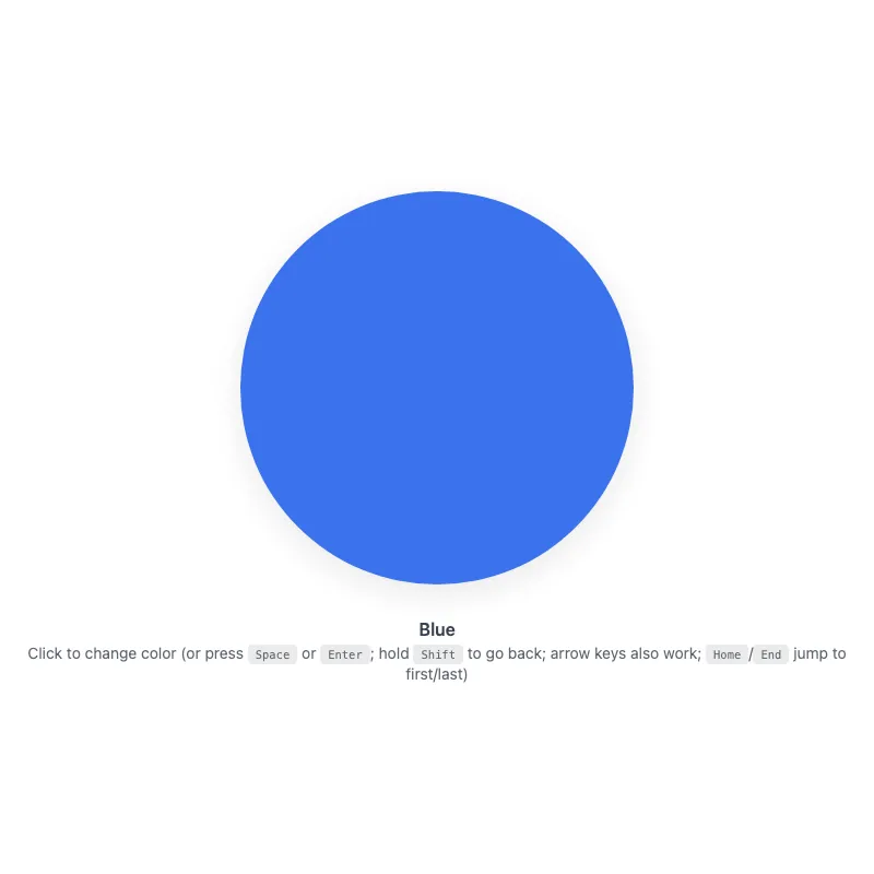
offline render, Chrome 154, light scheme, 2 s of virtual time
runs in a sandboxed frame with no origin; live pages may fetch CDN fonts the offline render did not
<!DOCTYPE html>
<html lang="en">
<head>
  <meta charset="UTF-8">
  <meta name="viewport" content="width=device-width, initial-scale=1.0">
  <meta name="color-scheme" content="light dark">
  <title>Animated Circle - Interactive Demo</title>
  <meta name="description" content="A responsive, accessible circle that changes color when clicked">
  <meta name="theme-color" content="#ffffff" media="(prefers-color-scheme: light)">
  <meta name="theme-color" content="#111111" media="(prefers-color-scheme: dark)">
  <link rel="icon" href="data:,">
  <style>
    *,
    *::before,
    *::after {
      box-sizing: border-box;
      margin: 0;
      padding: 0;
    }
    :root {
      color-scheme: light dark;
      --bg: #fff;
      --text: #374151;
      --fg: #2563eb;
      --shadow: rgba(0, 0, 0, 0.1);
      --kbd-bg: rgba(0, 0, 0, 0.1);
    }
    [data-color="red"] { --fg: #dc2626; }
    [data-color="green"] { --fg: #16a34a; }
    [data-color="amber"] { --fg: #d97706; }
    [data-color="violet"] { --fg: #7c3aed; }
    [data-color="cyan"] { --fg: #0891b2; }
    @media (prefers-color-scheme: dark) {
      :root {
        --bg: #111;
        --text: #d1d5db;
        --fg: #93c5fd;
        --shadow: rgba(0, 0, 0, 0.6);
        --kbd-bg: rgba(255, 255, 255, 0.15);
      }
      [data-color="red"] { --fg: #fca5a5; }
      [data-color="green"] { --fg: #86efac; }
      [data-color="amber"] { --fg: #fcd34d; }
      [data-color="violet"] { --fg: #c4b5fd; }
      [data-color="cyan"] { --fg: #67e8f9; }
    }
    @media (prefers-contrast: more) {
      :root {
        --shadow: rgba(0, 0, 0, 0.9);
      }
      .hint {
        opacity: 1;
      }
    }
    @media (forced-colors: active) {
      svg circle {
        stroke: CanvasText;
        stroke-width: 2;
      }
    }
    body {
      min-height: 100vh;
      min-height: 100dvh;
      display: grid;
      place-items: center;
      padding: 1rem;
      background: var(--bg);
      color: var(--text);
      font-family: system-ui, -apple-system, sans-serif;
    }
    main {
      width: 100%;
      display: flex;
      flex-direction: column;
      align-items: center;
      text-align: center;
    }
    button {
      display: block;
      width: min(360px, 100%, 60vh);
      aspect-ratio: 1;
      border: 0;
      border-radius: 50%;
      background: none;
      color: var(--fg);
      cursor: pointer;
      touch-action: manipulation;
      -webkit-tap-highlight-color: transparent;
      transition: color 0.4s ease;
    }
    .no-transition,
    .no-transition svg {
      transition: none !important;
    }
    button:focus-visible {
      outline: 3px solid currentColor;
      outline-offset: 8px;
    }
    svg {
      display: block;
      width: 100%;
      height: 100%;
      overflow: visible;
      opacity: 0.9;
      filter: drop-shadow(0 8px 16px var(--shadow));
      transition: opacity 0.3s ease;
    }
    button:active svg,
    button:focus-visible svg {
      opacity: 1;
    }
    @keyframes pulse {
      0% {
        filter: drop-shadow(0 8px 16px var(--shadow)) drop-shadow(0 0 20px currentColor);
      }
      100% {
        filter: drop-shadow(0 8px 16px var(--shadow));
      }
    }
    @media (hover: hover) {
      button:hover svg {
        opacity: 1;
      }
    }
    @media (prefers-reduced-motion: no-preference) {
      svg {
        transition:
          transform 0.3s cubic-bezier(0.34, 1.56, 0.64, 1),
          opacity 0.3s ease;
      }
      button:focus-visible svg {
        transform: scale(1.05);
      }
      button:active svg {
        transform: scale(0.97);
      }
      button.color-changed svg {
        animation: pulse 0.5s ease-out;
      }
    }
    @media (hover: hover) and (prefers-reduced-motion: no-preference) {
      button:hover:not(:active) svg {
        transform: scale(1.05);
      }
    }
    .visually-hidden {
      position: absolute;
      width: 1px;
      height: 1px;
      overflow: hidden;
      clip-path: inset(50%);
      white-space: nowrap;
    }
    .status {
      margin-top: 2rem;
      font-weight: 600;
    }
    .hint {
      margin-top: 0.25rem;
      font-size: 0.875rem;
      opacity: 0.8;
    }
    kbd {
      display: inline-block;
      padding: 0.125rem 0.375rem;
      background: var(--kbd-bg);
      border: 1px solid transparent;
      border-radius: 0.25rem;
      font-family: monospace;
      font-size: 0.75em;
    }
  </style>
</head>
<body>
  <main>
    <h1 class="visually-hidden">Animated Circle</h1>
    <button type="button" class="no-transition" aria-label="Change circle color" aria-describedby="status hint">
      <svg viewBox="0 0 100 100" aria-hidden="true" focusable="false" xmlns="http://www.w3.org/2000/svg">
        <circle cx="50" cy="50" r="50" fill="currentColor"/>
      </svg>
    </button>
    <p class="status" id="status" role="status" aria-atomic="true">Blue</p>
    <p class="hint" id="hint"><span class="verb">Click</span> to change color (or press <kbd>Space</kbd> or <kbd>Enter</kbd>; hold <kbd>Shift</kbd> to go back; arrow keys also work; <kbd>Home</kbd>/<kbd>End</kbd> jump to first/last)</p>
  </main>
  <script>
    const button = document.querySelector('button');
    const status = document.querySelector('.status');
    const colors = ['blue', 'red', 'green', 'amber', 'violet', 'cyan'];
    const storageKey = 'circle-color';

    // Safely retrieve saved color from localStorage, returning null if unavailable
    function loadColor() {
      try {
        return localStorage.getItem(storageKey);
      } catch {
        return null;
      }
    }

    // Safely save color to localStorage, silently failing if unavailable
    function saveColor(color) {
      try {
        localStorage.setItem(storageKey, color);
      } catch {}
    }

    const savedColor = loadColor();
    let index = colors.includes(savedColor) ? colors.indexOf(savedColor) : 0;

    // Apply current color to button and update status display
    function applyColor() {
      const color = colors[index];
      if (color === 'blue') {
        delete button.dataset.color;
      } else {
        button.dataset.color = color;
      }
      status.textContent = color[0].toUpperCase() + color.slice(1);
    }

    // Cycle color by step amount and trigger pulse animation
    function changeColor(step) {
      index = (index + step + colors.length) % colors.length;
      applyColor();
      saveColor(colors[index]);

      button.classList.remove('color-changed');
      void button.offsetWidth;
      button.classList.add('color-changed');
    }

    applyColor();
    // Enable transitions only after the restored color has been painted
    requestAnimationFrame(() => {
      requestAnimationFrame(() => {
        button.classList.remove('no-transition');
      });
    });

    // Update instructions to show "Tap" on touch devices or "Click" on hover-capable devices
    const hoverQuery = matchMedia('(hover: none)');
    const verbSpan = document.querySelector('.hint .verb');
    function updateVerb() {
      verbSpan.textContent = hoverQuery.matches ? 'Tap' : 'Click';
    }
    updateVerb();
    hoverQuery.addEventListener('change', updateVerb);

    // Space and Enter activate through the native click, but keyboard-synthesized
    // clicks don't reliably carry shiftKey, so remember it from the key events
    let shiftHeld = false;
    const isActivationKey = (event) => event.key === 'Enter' || event.key === ' ';
    button.addEventListener('keyup', (event) => {
      if (isActivationKey(event)) shiftHeld = event.shiftKey;
    });
    button.addEventListener('blur', () => {
      shiftHeld = false;
    });

    const keySteps = { ArrowRight: 1, ArrowDown: 1, ArrowLeft: -1, ArrowUp: -1 };
    button.addEventListener('keydown', (event) => {
      if (isActivationKey(event)) {
        shiftHeld = event.shiftKey;
        // Holding Enter would otherwise fire a click on every repeat
        if (event.repeat && event.key === 'Enter') event.preventDefault();
        return;
      }
      if (event.altKey || event.ctrlKey || event.metaKey) return;
      if (event.key in keySteps) {
        event.preventDefault();
        changeColor(keySteps[event.key]);
      } else if (event.key === 'Home') {
        event.preventDefault();
        changeColor(-index);
      } else if (event.key === 'End') {
        event.preventDefault();
        changeColor(colors.length - 1 - index);
      }
    });
    button.addEventListener('click', (event) => {
      changeColor(event.shiftKey || shiftHeld ? -1 : 1);
      shiftHeld = false;
    });
    button.addEventListener('animationend', () => {
      button.classList.remove('color-changed');
    });
    // Sync color across tabs when storage changes
    addEventListener('storage', (event) => {
      if (event.key === storageKey && event.newValue && colors.includes(event.newValue)) {
        index = colors.indexOf(event.newValue);
        applyColor();
      }
    });
  </script>
</body>
</html>
what changed from step 020
+26 / -9 lines
applyColor();- button.addEventListener('transitionend', () => {- button.classList.remove('no-transition');- }, { once: true });+ // Enable transitions only after the restored color has been painted+ requestAnimationFrame(() => {+ requestAnimationFrame(() => {+ button.classList.remove('no-transition');+ });+ }); // Update instructions to show "Tap" on touch devices or "Click" on hover-capable devices⋯ line 247 hoverQuery.addEventListener('change', updateVerb); - // Handle keyboard input directly: keyboard-synthesized clicks don't reliably carry shiftKey+ // Space and Enter activate through the native click, but keyboard-synthesized+ // clicks don't reliably carry shiftKey, so remember it from the key events+ let shiftHeld = false;+ const isActivationKey = (event) => event.key === 'Enter' || event.key === ' ';+ button.addEventListener('keyup', (event) => {+ if (isActivationKey(event)) shiftHeld = event.shiftKey;+ });+ button.addEventListener('blur', () => {+ shiftHeld = false;+ });+ const keySteps = { ArrowRight: 1, ArrowDown: 1, ArrowLeft: -1, ArrowUp: -1 }; button.addEventListener('keydown', (event) => {+ if (isActivationKey(event)) {+ shiftHeld = event.shiftKey;+ // Holding Enter would otherwise fire a click on every repeat+ if (event.repeat && event.key === 'Enter') event.preventDefault();+ return;+ } if (event.altKey || event.ctrlKey || event.metaKey) return;- if (event.key === 'Enter' || event.key === ' ') {+ if (event.key in keySteps) { event.preventDefault();- if (!event.repeat) changeColor(event.shiftKey ? -1 : 1);- } else if (event.key in keySteps) {- event.preventDefault(); changeColor(keySteps[event.key]); } else if (event.key === 'Home') {⋯ line 279 }); button.addEventListener('click', (event) => {- changeColor(event.shiftKey ? -1 : 1);+ changeColor(event.shiftKey || shiftHeld ? -1 : 1);+ shiftHeld = false; }); button.addEventListener('animationend', () => {
What the model said
I fixed two bugs in `0.html`, but the changes are untested: both commands I tried to check them with (a browser/tooling lookup and a syntax check of the inline script) were denied by this session's permissions.

## What changed

**1. Transitions now work**

The button started with a `no-transition` class that was only removed on `transitionend`, which can't fire while transitions are off. The colour fade and the hover/press scale therefore never animated. The class is now removed two animation frames after load, so the saved colour still appears without a fade-in and everything animates after that.

**2. Space and Enter go through the button's native click**

The old handler called `preventDefault()` on keydown and changed the colour itself. That suppressed the button's pressed state, and in any browser that still fires the click on Space keyup it would step twice per press. Now:

- Space and Enter trigger the normal click, and the click handler does the colour change.
- Shift state is remembered from the key events, so Shift+Space and Shift+Enter still go backwards.
- Holding Enter still changes the colour only once.
- Arrow keys and Home/End behave as before.

One behaviour difference: Ctrl/Alt/Cmd + Enter or Space now activates the button, where the old handler ignored those combinations.

## Worth checking in a browser

- Clicking fades the colour and hover scales the circle.
- Space, Enter, Shift+Space and Shift+Enter each step exactly once, in the right direction, ideally in Firefox as well as Chrome or Safari.
- Reloading restores the saved colour with no fade from blue.

## Left alone

The rest of the file (theming, reduced-motion, forced-colours, storage sync) looked sound. Two optional things I did not change:

- The hint line is long; it could be trimmed to something like "Click to change colour · Shift to go back · arrow keys also work".
- The button's `aria-describedby` points at the status, which is also a live region, so some screen readers may announce the colour twice.