Runs/circle · chain · relay/009
circle · chain · relay · step 009 of 64
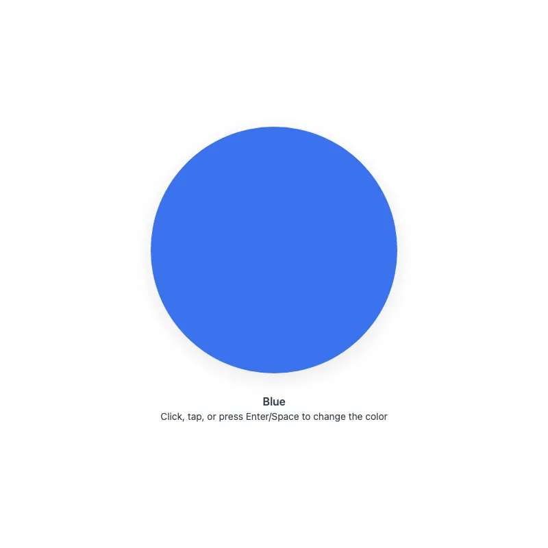
offline render, Chrome 154, light scheme, 2 s of virtual time
runs in a sandboxed frame with no origin; live pages may fetch CDN fonts the offline render did not
<!DOCTYPE html>
<html lang="en">
<head>
  <meta charset="UTF-8">
  <meta name="viewport" content="width=device-width, initial-scale=1.0">
  <meta name="color-scheme" content="light dark">
  <title>Animated Circle - Interactive Demo</title>
  <meta name="description" content="A responsive, accessible circle that changes color when clicked">
  <style>
    *,
    *::before,
    *::after {
      box-sizing: border-box;
      margin: 0;
      padding: 0;
    }
    :root {
      color-scheme: light dark;
      --bg: #fff;
      --text: #374151;
      --fg: #2563eb;
      --shadow: rgba(0, 0, 0, 0.1);
    }
    [data-color="red"] { --fg: #dc2626; }
    [data-color="green"] { --fg: #16a34a; }
    [data-color="amber"] { --fg: #d97706; }
    [data-color="violet"] { --fg: #7c3aed; }
    [data-color="cyan"] { --fg: #0891b2; }
    @media (prefers-color-scheme: dark) {
      :root {
        --bg: #111;
        --text: #d1d5db;
        --fg: #93c5fd;
        --shadow: rgba(0, 0, 0, 0.6);
      }
      [data-color="red"] { --fg: #fca5a5; }
      [data-color="green"] { --fg: #86efac; }
      [data-color="amber"] { --fg: #fcd34d; }
      [data-color="violet"] { --fg: #c4b5fd; }
      [data-color="cyan"] { --fg: #67e8f9; }
    }
    @media (prefers-contrast: more) {
      :root {
        --shadow: rgba(0, 0, 0, 0.9);
      }
    }
    body {
      min-height: 100dvh;
      display: grid;
      place-items: center;
      padding: 1rem;
      background: var(--bg);
      color: var(--text);
      font-family: system-ui, -apple-system, sans-serif;
    }
    main {
      width: 100%;
      display: flex;
      flex-direction: column;
      align-items: center;
      text-align: center;
    }
    button {
      display: block;
      width: min(360px, 100%);
      aspect-ratio: 1;
      border: 0;
      border-radius: 50%;
      background: none;
      color: var(--fg);
      cursor: pointer;
      touch-action: manipulation;
      -webkit-tap-highlight-color: transparent;
    }
    button:focus-visible {
      outline: 3px solid var(--fg);
      outline-offset: 8px;
    }
    svg {
      display: block;
      width: 100%;
      height: 100%;
      overflow: visible;
      opacity: 0.9;
      filter: drop-shadow(0 8px 16px var(--shadow));
      transition: opacity 0.3s ease;
    }
    circle {
      transition: fill 0.4s ease;
    }
    button:active svg,
    button:focus-visible svg {
      opacity: 1;
    }
    @media (hover: hover) {
      button:hover svg {
        opacity: 1;
      }
    }
    @media (prefers-reduced-motion: no-preference) {
      svg {
        transition:
          transform 0.3s cubic-bezier(0.34, 1.56, 0.64, 1),
          opacity 0.3s ease;
      }
      button:focus-visible svg {
        transform: scale(1.05);
      }
      button:active svg {
        transform: scale(0.97);
      }
    }
    @media (hover: hover) and (prefers-reduced-motion: no-preference) {
      button:hover:not(:active) svg {
        transform: scale(1.05);
      }
    }
    .status {
      margin-top: 2rem;
      font-weight: 600;
    }
    .hint {
      margin-top: 0.25rem;
      font-size: 0.875rem;
    }
  </style>
</head>
<body>
  <main>
    <button type="button" aria-label="Change circle color">
      <svg viewBox="0 0 100 100" aria-hidden="true" focusable="false" xmlns="http://www.w3.org/2000/svg">
        <circle cx="50" cy="50" r="50" fill="currentColor"/>
      </svg>
    </button>
    <p class="status" role="status">Blue</p>
    <p class="hint">Click, tap, or press Enter/Space to change the color</p>
  </main>
  <script>
    const button = document.querySelector('button');
    const status = document.querySelector('.status');
    const colors = ['blue', 'red', 'green', 'amber', 'violet', 'cyan'];
    let index = 0;

    button.addEventListener('click', () => {
      index = (index + 1) % colors.length;
      const color = colors[index];
      button.dataset.color = color;
      status.textContent = color[0].toUpperCase() + color.slice(1);
    });
  </script>
</body>
</html>
what changed from step 008
+69 / -50 lines
<meta name="color-scheme" content="light dark"> <title>Animated Circle - Interactive Demo</title>- <meta name="description" content="A responsive, accessible animated circle with hover effects">+ <meta name="description" content="A responsive, accessible circle that changes color when clicked"> <style> *,⋯ line 16 } :root {+ color-scheme: light dark; --bg: #fff;+ --text: #374151; --fg: #2563eb; --shadow: rgba(0, 0, 0, 0.1); }+ [data-color="red"] { --fg: #dc2626; }+ [data-color="green"] { --fg: #16a34a; }+ [data-color="amber"] { --fg: #d97706; }+ [data-color="violet"] { --fg: #7c3aed; }+ [data-color="cyan"] { --fg: #0891b2; } @media (prefers-color-scheme: dark) { :root { --bg: #111;+ --text: #d1d5db; --fg: #93c5fd; --shadow: rgba(0, 0, 0, 0.6); }+ [data-color="red"] { --fg: #fca5a5; }+ [data-color="green"] { --fg: #86efac; }+ [data-color="amber"] { --fg: #fcd34d; }+ [data-color="violet"] { --fg: #c4b5fd; }+ [data-color="cyan"] { --fg: #67e8f9; } } @media (prefers-contrast: more) {⋯ line 45 } }- .hint {- margin-top: 1.5rem;- font-size: 0.875rem;- text-align: center;- opacity: 0.7;- } body { min-height: 100dvh;⋯ line 51 padding: 1rem; background: var(--bg);- color: var(--fg);+ color: var(--text); font-family: system-ui, -apple-system, sans-serif; }⋯ line 59 flex-direction: column; align-items: center;+ text-align: center; }+ button {+ display: block;+ width: min(360px, 100%);+ aspect-ratio: 1;+ border: 0;+ border-radius: 50%;+ background: none;+ color: var(--fg);+ cursor: pointer;+ touch-action: manipulation;+ -webkit-tap-highlight-color: transparent;+ }+ button:focus-visible {+ outline: 3px solid var(--fg);+ outline-offset: 8px;+ } svg { display: block;- width: min(400px, 100%);- height: auto;+ width: 100%;+ height: 100%; overflow: visible;+ opacity: 0.9; filter: drop-shadow(0 8px 16px var(--shadow));+ transition: opacity 0.3s ease; } circle {- transition: opacity 0.3s ease, color 0.4s ease;- transform-box: fill-box;- transform-origin: center;- opacity: 0.9;- will-change: transform, opacity;+ transition: fill 0.4s ease; }- svg:focus {- outline: none;+ button:active svg,+ button:focus-visible svg {+ opacity: 1; }- svg:focus-visible {- outline: 3px solid var(--fg);- outline-offset: 8px;- border-radius: 50%;- } @media (hover: hover) {- circle:hover {+ button:hover svg { opacity: 1; } }- circle:active,- svg:focus-visible circle {- opacity: 1;- } @media (prefers-reduced-motion: no-preference) {- circle {+ svg { transition: transform 0.3s cubic-bezier(0.34, 1.56, 0.64, 1), opacity 0.3s ease; }- circle:active,- svg:focus-visible circle {+ button:focus-visible svg { transform: scale(1.05); }+ button:active svg {+ transform: scale(0.97);+ } } @media (hover: hover) and (prefers-reduced-motion: no-preference) {- circle:hover {+ button:hover:not(:active) svg { transform: scale(1.05); } }+ .status {+ margin-top: 2rem;+ font-weight: 600;+ }+ .hint {+ margin-top: 0.25rem;+ font-size: 0.875rem;+ } </style> </head> <body> <main>- <svg viewBox="0 0 400 400" role="button" aria-labelledby="circle-title" aria-pressed="false" tabindex="0" xmlns="http://www.w3.org/2000/svg">- <title id="circle-title">Colored circle. Click or press Enter/Space to change its color. Grows slightly on hover or focus.</title>- <circle cx="200" cy="200" r="180" fill="currentColor"/>- </svg>- <p class="hint">Click or press Enter/Space to change the color</p>+ <button type="button" aria-label="Change circle color">+ <svg viewBox="0 0 100 100" aria-hidden="true" focusable="false" xmlns="http://www.w3.org/2000/svg">+ <circle cx="50" cy="50" r="50" fill="currentColor"/>+ </svg>+ </button>+ <p class="status" role="status">Blue</p>+ <p class="hint">Click, tap, or press Enter/Space to change the color</p> </main> <script>- const svg = document.querySelector('svg');- const colors = ['#2563eb', '#dc2626', '#16a34a', '#d97706', '#7c3aed', '#0891b2'];+ const button = document.querySelector('button');+ const status = document.querySelector('.status');+ const colors = ['blue', 'red', 'green', 'amber', 'violet', 'cyan']; let index = 0; - function cycleColor() {+ button.addEventListener('click', () => { index = (index + 1) % colors.length;- svg.style.color = colors[index];- svg.setAttribute('aria-pressed', 'true');- setTimeout(() => svg.setAttribute('aria-pressed', 'false'), 300);- }- - svg.addEventListener('click', cycleColor);- svg.addEventListener('keydown', (e) => {- if (e.key === 'Enter' || e.key === ' ') {- e.preventDefault();- cycleColor();- }+ const color = colors[index];+ button.dataset.color = color;+ status.textContent = color[0].toUpperCase() + color.slice(1); }); </script>
What the model said
I rewrote `0.html` to fix several accessibility and behaviour problems, but it is untested in a browser: my headless Chrome screenshot attempt was blocked by the session's permissions.

## What was wrong and what changed

| Problem | Fix |
|---|---|
| The SVG was posing as a button (`role="button"`, `tabindex`, hand-written key handling). | It is now a real `<button>` with a decorative SVG inside, so keyboard and focus behaviour come from the browser. |
| `aria-pressed` flipped to true for 300 ms on each click, which wrongly marks it as a toggle button. | Removed. |
| The accessible name was a long instructional sentence, which also showed up as a tooltip. | The name is now "Change circle color". |
| Screen reader users were never told the colour had changed. | A visible `role="status"` label (Blue, Red, …) announces each change. |
| Clicking the empty corners of the square SVG changed the colour. | The button is circular, so the clickable area matches the shape. |
| The colour fade only ran for users with reduced motion, because a later rule overrode the transition. | The fade now applies for everyone; only the scaling is limited to users who allow motion. |
| The colours set from JS ignored dark mode, giving dark shades on a `#111` background. | The palette lives in CSS with a lighter dark-mode variant for each colour; JS only sets `data-color`. |
| The hint text was coloured at 0.7 opacity, which fell below 4.5:1 contrast. | The hint uses a neutral text colour at full opacity. |
| `will-change` was permanently set on the circle. | Removed. |

## Changes you might not expect

- **Press feedback:** the circle now shrinks slightly while pressed.
- **Touch tweaks:** I added `touch-action: manipulation` and removed the tap highlight.
- **Hint wording:** the hint now mentions tapping as well as clicking.
- **Colour label:** the colour name is new visible text under the circle.

The circle is still 360px across at full size.