Runs/circle · chain · Sonnet 5/015
circle · chain · Sonnet 5 · step 015 of 64
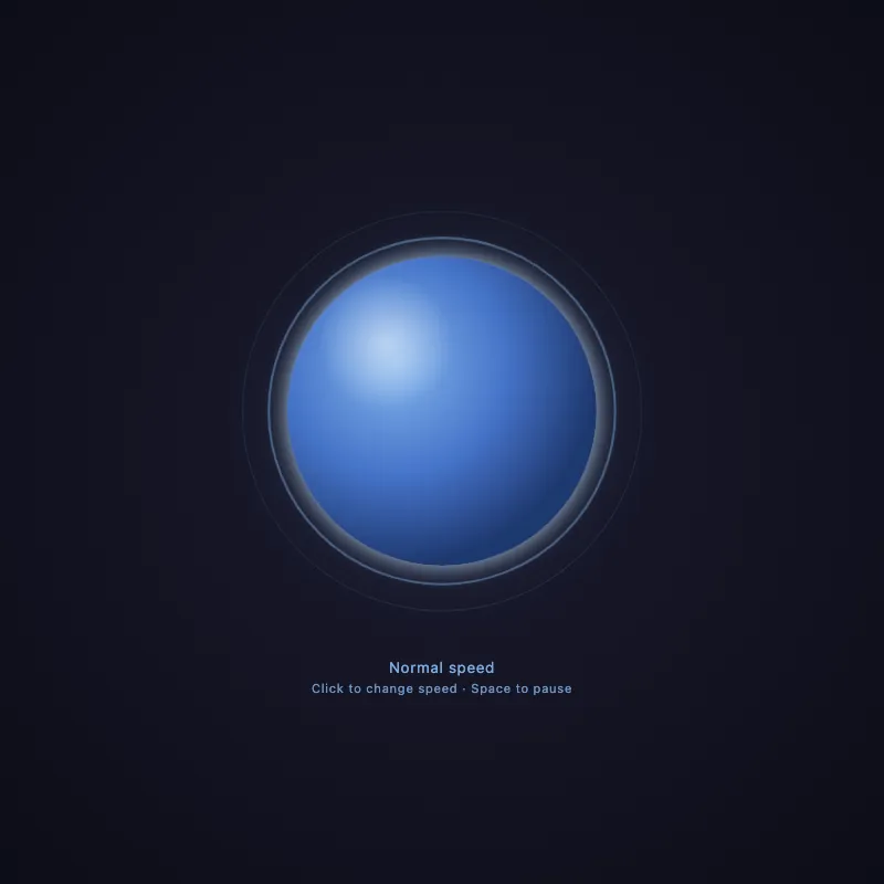
offline render, Chrome 154, light scheme, 2 s of virtual time
runs in a sandboxed frame with no origin; live pages may fetch CDN fonts the offline render did not
<!DOCTYPE html>
<html lang="en">
<head>
  <meta charset="UTF-8">
  <meta name="viewport" content="width=device-width, initial-scale=1.0">
  <meta name="description" content="An accessible, animated pulsing circle with adjustable speed and pause controls.">
  <meta name="color-scheme" content="dark">
  <title>Pulsing Circle</title>
  <style>
    :root {
      --circle-hue: #8ec5ff;
      --circle-core: #4a7dd9;
      --circle-shadow: #1f3a75;
      --cycle: 2.5s;
    }
    * {
      margin: 0;
      padding: 0;
      box-sizing: border-box;
    }
    body {
      width: 100vw;
      height: 100vh;
      height: 100dvh;
      display: flex;
      flex-direction: column;
      justify-content: center;
      align-items: center;
      gap: 24px;
      background: radial-gradient(circle at center, #1a1a2e 0%, #0d0d17 100%);
      overflow: hidden;
    }
    svg {
      width: min(400px, 80vmin);
      height: min(400px, 80vmin);
      overflow: visible;
      cursor: pointer;
      user-select: none;
      -webkit-tap-highlight-color: transparent;
      transition: filter 0.3s ease;
    }
    svg:hover {
      filter: brightness(1.08);
    }
    svg:focus-visible {
      outline: 2px solid var(--circle-hue);
      outline-offset: 8px;
      border-radius: 50%;
    }
    .ambient {
      fill: var(--circle-hue);
      opacity: 0.12;
      filter: blur(30px);
      animation: breathe var(--cycle) cubic-bezier(0.4, 0, 0.2, 1) infinite;
      transform-origin: 200px 200px;
      will-change: transform, opacity;
    }
    .core {
      animation: pulse var(--cycle) cubic-bezier(0.4, 0, 0.2, 1) infinite;
      transform-origin: 200px 200px;
      filter: url(#glow);
      will-change: transform, opacity;
    }
    .highlight {
      fill: url(#highlightGradient);
      transform-origin: 200px 200px;
      animation: pulse var(--cycle) cubic-bezier(0.4, 0, 0.2, 1) infinite;
      pointer-events: none;
      will-change: transform, opacity;
    }
    .ring {
      fill: none;
      stroke: var(--circle-hue);
      stroke-width: 2.5;
      transform-origin: 200px 200px;
      animation: ripple var(--cycle) cubic-bezier(0.2, 0.6, 0.4, 1) infinite;
      will-change: transform, opacity, stroke-width;
    }
    .ring--delay-1 {
      animation-delay: calc(var(--cycle) / 3);
    }
    .ring--delay-2 {
      animation-delay: calc(var(--cycle) / 3 * 2);
    }
    @keyframes pulse {
      0%, 100% {
        transform: scale(1);
        opacity: 0.9;
      }
      50% {
        transform: scale(1.05);
        opacity: 1;
      }
    }
    @keyframes breathe {
      0%, 100% {
        transform: scale(0.95);
        opacity: 0.1;
      }
      50% {
        transform: scale(1.1);
        opacity: 0.18;
      }
    }
    @keyframes ripple {
      0% {
        transform: scale(1);
        opacity: 0.6;
        stroke-width: 2.5;
      }
      100% {
        transform: scale(1.35);
        opacity: 0;
        stroke-width: 0.5;
      }
    }
    body.paused .core,
    body.paused .ring,
    body.paused .ambient,
    body.paused .highlight {
      animation-play-state: paused;
    }
    @media (prefers-reduced-motion: reduce) {
      .core, .ring, .ambient, .highlight {
        animation-play-state: paused;
      }
    }
    .speed-label {
      color: var(--circle-hue);
      font-family: system-ui, sans-serif;
      font-size: 0.85rem;
      letter-spacing: 0.05em;
      opacity: 0.85;
      user-select: none;
      text-align: center;
    }
    .hint {
      display: block;
      margin-top: 4px;
      font-size: 0.7rem;
      opacity: 0.85;
    }
  </style>
</head>
<body>
  <svg id="ae683f770" viewBox="0 0 400 400" role="button" tabindex="0" aria-label="Pulsing blue circle animation. Click or press Enter to change pulse speed. Press space to pause." aria-describedby="speedText" aria-pressed="false">
    <defs>
      <radialGradient id="circleGradient" cx="35%" cy="35%" r="65%">
        <stop offset="0%" stop-color="#8ec5ff"/>
        <stop offset="55%" stop-color="#4a7dd9"/>
        <stop offset="100%" stop-color="#1f3a75"/>
      </radialGradient>
      <radialGradient id="highlightGradient" cx="32%" cy="28%" r="22%">
        <stop offset="0%" stop-color="#ffffff" stop-opacity="0.55"/>
        <stop offset="100%" stop-color="#ffffff" stop-opacity="0"/>
      </radialGradient>
      <filter id="glow" x="-80%" y="-80%" width="260%" height="260%">
        <feGaussianBlur in="SourceGraphic" stdDeviation="10" result="blur"/>
        <feColorMatrix in="blur" type="matrix"
          values="0 0 0 0 0.55  0 0 0 0 0.77  0 0 0 0 1  0 0 0 0.9 0" result="tintedBlur"/>
        <feMerge>
          <feMergeNode in="tintedBlur"/>
          <feMergeNode in="SourceGraphic"/>
        </feMerge>
      </filter>
    </defs>
    <circle class="ambient" cx="200" cy="200" r="160"/>
    <circle class="ring" cx="200" cy="200" r="140"/>
    <circle class="ring ring--delay-1" cx="200" cy="200" r="140"/>
    <circle class="ring ring--delay-2" cx="200" cy="200" r="140"/>
    <circle class="core" cx="200" cy="200" r="140" fill="url(#circleGradient)"/>
    <circle class="highlight" cx="200" cy="200" r="140"/>
  </svg>
  <p class="speed-label" id="speedLabel" aria-live="polite">
    <span id="speedText">Normal speed</span>
    <span class="hint">Click to change speed · Space to pause</span>
  </p>
  <script>
    const svg = document.getElementById('ae683f770');
    const speedText = document.getElementById('speedText');
    const speeds = [
      { value: '2.5s', name: 'Normal speed' },
      { value: '1.2s', name: 'Fast speed' },
      { value: '4.5s', name: 'Slow speed' },
    ];
    let speedIndex = 0;
    const reducedMotionQuery = window.matchMedia('(prefers-reduced-motion: reduce)');
    let manuallyPaused = reducedMotionQuery.matches;

    function updateLabels() {
      const { name } = speeds[speedIndex];
      speedText.textContent = manuallyPaused ? `${name} (paused)` : name;
    }

    function cycleSpeed() {
      speedIndex = (speedIndex + 1) % speeds.length;
      const { value } = speeds[speedIndex];
      svg.style.setProperty('--cycle', value);
      // Restart animations from the beginning so the new speed feels immediate
      // instead of jumping mid-cycle.
      document.querySelectorAll('.core, .ring, .ambient, .highlight').forEach((el) => {
        el.style.animation = 'none';
        void el.offsetWidth;
        el.style.animation = '';
      });
      updateLabels();
    }

    function togglePause() {
      manuallyPaused = !manuallyPaused;
      document.body.classList.toggle('paused', manuallyPaused);
      svg.setAttribute('aria-pressed', String(manuallyPaused));
      updateLabels();
    }

    svg.addEventListener('click', cycleSpeed);
    svg.addEventListener('keydown', (e) => {
      if (e.key === 'Enter') {
        e.preventDefault();
        cycleSpeed();
      } else if (e.key === ' ') {
        e.preventDefault();
        togglePause();
      }
    });

    document.addEventListener('visibilitychange', () => {
      document.body.classList.toggle('paused', document.hidden || manuallyPaused);
    });

    reducedMotionQuery.addEventListener('change', (e) => {
      manuallyPaused = e.matches;
      document.body.classList.toggle('paused', manuallyPaused);
      svg.setAttribute('aria-pressed', String(manuallyPaused));
      updateLabels();
    });

    document.body.classList.toggle('paused', manuallyPaused);
    svg.setAttribute('aria-pressed', String(manuallyPaused));
    updateLabels();
  </script>
</body>
</html>
what changed from step 014
+7 / -2 lines
<meta charset="UTF-8"> <meta name="viewport" content="width=device-width, initial-scale=1.0">+ <meta name="description" content="An accessible, animated pulsing circle with adjustable speed and pause controls.">+ <meta name="color-scheme" content="dark"> <title>Pulsing Circle</title> <style>⋯ line 22 width: 100vw; height: 100vh;+ height: 100dvh; display: flex; flex-direction: column;⋯ line 36 overflow: visible; cursor: pointer;+ user-select: none;+ -webkit-tap-highlight-color: transparent; transition: filter 0.3s ease; }⋯ line 131 font-size: 0.85rem; letter-spacing: 0.05em;- opacity: 0.7;+ opacity: 0.85; user-select: none; text-align: center;⋯ line 139 margin-top: 4px; font-size: 0.7rem;- opacity: 0.75;+ opacity: 0.85; } </style>
What the model said
Made these improvements to `0.html`:

- **Mobile viewport fix**: added `100dvh` (with `100vh` fallback) so the layout doesn't get clipped by mobile browser UI chrome.
- **Touch/UX polish**: added `user-select: none` and `-webkit-tap-highlight-color: transparent` on the SVG to prevent accidental text selection and the blue tap flash on mobile taps.
- **Accessibility contrast**: bumped the speed label/hint text opacity from 0.7/0.75 to 0.85 for better WCAG contrast readability.
- **SEO/meta**: added a `<meta name="description">` and `color-scheme: dark` so browser UI (scrollbars, form controls) matches the dark theme.

The core animation logic, ARIA setup, and speed-cycling/pause interactions were already solid, so I left those as-is.