Runs/circle · chain · Haiku 4.5/026
circle · chain · Haiku 4.5 · step 026 of 64
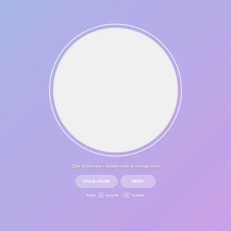
offline render, Chrome 154, light scheme, 2 s of virtual time
runs in a sandboxed frame with no origin; live pages may fetch CDN fonts the offline render did not
<!DOCTYPE html>
<html lang="en">
<head>
  <meta charset="UTF-8">
  <meta name="viewport" content="width=device-width, initial-scale=1.0">
  <meta name="description" content="Interactive color-changing circle with smooth animations. Click to activate, double-click to cycle through 4 vibrant colors. Full keyboard and touch support.">
  <meta name="theme-color" content="#5f6fd1" media="(prefers-color-scheme: dark)">
  <meta name="theme-color" content="#a8b5e8" media="(prefers-color-scheme: light)">
  <meta name="color-scheme" content="light dark">
  <title>Interactive Circle - Color Demo</title>
  <style>
    :root {
      --color-white: #ffffff;
      --color-gold: #ffd700;
      --color-pink: #ff6b9d;
      --color-teal: #4ecdc4;
      --color-mint: #95e1d3;
      --shadow-color: rgba(0, 0, 0, 0.3);
      --transition-normal: 0.3s ease;
      --transition-slow: 0.6s ease-out;
      --pulse-duration: 2.5s;
      --color-mode-1-rgb: 255, 107, 157;
      --color-mode-2-rgb: 78, 205, 196;
      --color-mode-3-rgb: 149, 225, 211;
    }

    * {
      margin: 0;
      padding: 0;
      box-sizing: border-box;
    }
    html, body {
      width: 100%;
      height: 100%;
      overflow: hidden;
    }
    body {
      display: flex;
      flex-direction: column;
      justify-content: center;
      align-items: center;
      gap: 20px;
      background: linear-gradient(135deg, #5f6fd1 0%, #6b3fa0 100%);
      font-family: -apple-system, BlinkMacSystemFont, "Segoe UI", Roboto, sans-serif;
      color: var(--color-white);
      font-size: 14px;
      padding: 20px;
      min-height: 100vh;
    }
    .circle-container {
      cursor: pointer;
      border: none;
      background: none;
      padding: 0;
      position: relative;
      contain: layout style paint;
      transition: transform var(--transition-normal);
      user-select: none;
      touch-action: manipulation;
      -webkit-tap-highlight-color: transparent;
    }
    .circle-container:hover {
      transform: scale(1.06);
    }
    .circle-container:focus {
      outline: none;
    }
    .circle-container:focus-visible {
      transform: scale(1.08);
      outline: 3px solid rgba(255, 255, 255, 0.8);
      outline-offset: 10px;
      border-radius: 50%;
      box-shadow: 0 0 0 1px rgba(255, 255, 255, 0.3);
    }
    svg {
      width: min(400px, 80vw);
      height: min(400px, 80vw);
      display: block;
      animation: fadeIn var(--transition-slow);
    }
    circle {
      fill: var(--color-white);
      stroke: rgba(255, 255, 255, 0.25);
      stroke-width: 1.5;
      animation: pulse var(--pulse-duration) ease-in-out infinite;
      filter: drop-shadow(0 20px 40px var(--shadow-color));
      transition: fill 0.3s cubic-bezier(0.34, 1.56, 0.64, 1), r 0.3s ease, stroke 0.3s ease, filter 0.3s ease;
      will-change: fill, r, filter;
    }
    .circle-container:is(:hover, :focus-visible) circle {
      fill: #e8f4f8;
      r: 205;
      stroke: rgba(255, 255, 255, 0.4);
    }
    .circle-container.active:not([class*="color-mode-"]) circle {
      fill: var(--color-gold);
      stroke: rgba(255, 215, 0, 0.3);
      animation: pulse-active 0.6s ease-in-out;
      filter: drop-shadow(0 20px 40px rgba(255, 215, 0, 0.5));
      r: 200;
    }

    .circle-container.color-mode-1 { --mode-color: var(--color-pink); --mode-rgb: var(--color-mode-1-rgb); }
    .circle-container.color-mode-2 { --mode-color: var(--color-teal); --mode-rgb: var(--color-mode-2-rgb); }
    .circle-container.color-mode-3 { --mode-color: var(--color-mint); --mode-rgb: var(--color-mode-3-rgb); }

    [class*="color-mode-"] circle {
      fill: var(--mode-color);
      stroke: rgba(var(--mode-rgb), 0.3);
      filter: drop-shadow(0 20px 40px rgba(var(--mode-rgb), 0.3));
    }
    [class*="color-mode-"]:is(:hover, :focus-visible) circle {
      stroke: rgba(var(--mode-rgb), 0.5);
    }
    [class*="color-mode-"].active circle {
      animation: pulse-active 0.6s ease-in-out;
      filter: drop-shadow(0 20px 40px rgba(var(--mode-rgb), 0.5));
    }

    .hint {
      font-size: 13px;
      opacity: 0.95;
      transition: opacity var(--transition-normal);
      letter-spacing: 0.3px;
      max-width: 95%;
      line-height: 1.5;
      margin-top: 2px;
      position: relative;
      text-shadow: 0 1px 4px rgba(0, 0, 0, 0.4);
      font-weight: 500;
    }

    .mode-indicator {
      font-size: 11px;
      opacity: 0;
      margin-top: 6px;
      letter-spacing: 1px;
      text-transform: uppercase;
      transition: opacity var(--transition-normal), transform 0.3s ease;
      height: 18px;
      font-weight: 600;
      transform: scale(0.95);
    }
    .mode-indicator.visible {
      opacity: 0.95;
      transform: scale(1);
    }

    .controls {
      display: flex;
      gap: 12px;
      margin-top: 6px;
      flex-wrap: wrap;
      justify-content: center;
      width: 100%;
    }

    .control-btn {
      padding: 11px 24px;
      font-size: 12px;
      font-weight: 600;
      letter-spacing: 0.6px;
      text-transform: uppercase;
      background: rgba(255, 255, 255, 0.18);
      color: var(--color-white);
      border: 1.5px solid rgba(255, 255, 255, 0.35);
      border-radius: 24px;
      cursor: pointer;
      transition: all var(--transition-normal);
      backdrop-filter: blur(4px);
      outline: none;
      min-height: 44px;
      min-width: 120px;
      display: flex;
      align-items: center;
      justify-content: center;
      user-select: none;
      -webkit-tap-highlight-color: transparent;
    }

    .control-btn:hover {
      background: rgba(255, 255, 255, 0.28);
      border-color: rgba(255, 255, 255, 0.6);
      transform: translateY(-2px);
      box-shadow: 0 8px 16px rgba(0, 0, 0, 0.2);
    }

    .control-btn:active {
      transform: translateY(0) scale(0.95);
      box-shadow: 0 2px 4px rgba(0, 0, 0, 0.15);
    }

    .control-btn:focus-visible {
      outline: 2px solid rgba(255, 255, 255, 0.8);
      outline-offset: 6px;
    }

    .control-btn:disabled {
      opacity: 0.5;
      cursor: not-allowed;
    }
    @keyframes pulse {
      0%, 100% { r: 200; opacity: 0.96; }
      50% { r: 202; opacity: 1; }
    }
    @keyframes pulse-active {
      0% { r: 200; }
      50% { r: 208; }
      100% { r: 200; }
    }
    @keyframes fadeIn {
      from { opacity: 0; transform: scale(0.95); }
      to { opacity: 1; transform: scale(1); }
    }
    @keyframes colorShift {
      0% { r: 200; filter: saturate(1) brightness(1); }
      50% { r: 210; filter: saturate(1.3) brightness(1.1); }
      100% { r: 200; filter: saturate(1) brightness(1); }
    }
    .circle-container.color-shifting circle {
      animation: colorShift 0.5s cubic-bezier(0.34, 1.56, 0.64, 1);
      transform-origin: center;
    }
    .keyboard-hint {
      font-size: 11px;
      opacity: 0.8;
      margin-top: 2px;
      letter-spacing: 0.2px;
      transition: opacity var(--transition-normal);
      font-weight: 500;
    }
    .keyboard-hint kbd {
      background: rgba(255, 255, 255, 0.15);
      border: 1.5px solid rgba(255, 255, 255, 0.35);
      border-radius: 4px;
      padding: 3px 8px;
      font-family: 'Monaco', 'Courier New', monospace;
      font-size: 10px;
      font-weight: 600;
      display: inline-block;
      margin: 0 3px;
      box-shadow: 0 2px 4px rgba(0, 0, 0, 0.15);
    }
    @media (pointer: coarse) {
      .keyboard-hint {
        display: none;
      }
    }
    main {
      display: flex;
      flex-direction: column;
      align-items: center;
      justify-content: center;
      gap: 14px;
      text-align: center;
      width: 100%;
      flex: 1;
    }

    @media (max-width: 600px) {
      svg {
        width: min(330px, 75vw);
        height: min(330px, 75vw);
      }
      .hint {
        font-size: 12px;
      }
      .control-btn {
        padding: 12px 22px;
        font-size: 11px;
      }
    }
    @media (max-width: 480px) {
      body {
        gap: 12px;
        padding: 16px;
      }
      .mode-indicator {
        font-size: 9px;
      }
    }
    @media (max-width: 360px) {
      body {
        gap: 10px;
        padding: 14px;
      }
      svg {
        width: min(290px, 72vw);
        height: min(290px, 72vw);
      }
      .controls {
        flex-wrap: wrap;
      }
      .mode-indicator {
        font-size: 10px;
      }
      .hint {
        font-size: 11px;
      }
      .keyboard-hint {
        font-size: 10px;
      }
      .keyboard-hint kbd {
        padding: 3px 7px;
        font-size: 9px;
      }
    }
    @media (prefers-reduced-motion: reduce) {
      * {
        animation: none !important;
        transition: none !important;
      }
    }
    @supports (backdrop-filter: blur(0)) {
      .control-btn {
        background: rgba(255, 255, 255, 0.1);
      }
    }
    @supports not (backdrop-filter: blur(0)) {
      .control-btn {
        background: rgba(0, 0, 0, 0.3);
      }
    }
    @media (prefers-color-scheme: light) {
      body {
        background: linear-gradient(135deg, #a8b5e8 0%, #c99fe6 100%);
      }
      circle {
        fill: #ffffff;
        stroke: rgba(0, 0, 0, 0.12);
      }
      .circle-container:is(:hover, :focus-visible) circle {
        fill: #f0f0f0;
        stroke: rgba(0, 0, 0, 0.2);
      }
      .control-btn {
        background: rgba(255, 255, 255, 0.3);
        border-color: rgba(255, 255, 255, 0.5);
      }
      .control-btn:hover {
        background: rgba(255, 255, 255, 0.4);
        border-color: rgba(255, 255, 255, 0.7);
      }
      .hint {
        opacity: 0.98;
      }
      .keyboard-hint {
        opacity: 0.8;
      }
    }
  </style>
</head>
<body>
  <main>
    <button type="button" class="circle-container" id="decorative-circle" aria-label="Interactive circle - press Space to toggle, double-click to change color" aria-pressed="false" aria-describedby="hint-text">
      <svg viewBox="0 0 400 400" aria-hidden="true" role="presentation">
        <circle cx="200" cy="200" r="200"/>
      </svg>
    </button>
    <div class="mode-indicator" id="mode-indicator" aria-live="polite" aria-atomic="true"></div>
    <div class="hint" id="hint-text" role="status" aria-live="polite" aria-relevant="text">Click to activate • Double-click to change color</div>
    <div class="controls" role="group" aria-label="Circle controls">
      <button type="button" class="control-btn" id="cycle-btn" aria-label="Cycle to next color">Cycle Color</button>
      <button type="button" class="control-btn" id="reset-btn" aria-label="Reset to default state">Reset</button>
    </div>
    <div class="keyboard-hint" aria-label="Keyboard shortcuts">Press <kbd>C</kbd> to cycle • <kbd>R</kbd> to reset</div>
  </main>

  <script defer>
    const CONFIG = {
      storageKey: 'circle-state',
      tapDelay: 300,
      colorShiftDuration: 500,
      colorModes: [
        { class: 'default', name: 'Default White' },
        { class: 'color-mode-1', name: 'Pink' },
        { class: 'color-mode-2', name: 'Teal' },
        { class: 'color-mode-3', name: 'Mint' }
      ],
      isTouch: 'ontouchstart' in window || navigator.maxTouchPoints > 0,
      pulseInterval: 2500
    };

    const el = {
      circle: document.getElementById('decorative-circle'),
      hint: document.getElementById('hint-text'),
      modeIndicator: document.getElementById('mode-indicator'),
      cycleBtn: document.getElementById('cycle-btn'),
      resetBtn: document.getElementById('reset-btn')
    };

    let state = { active: false, colorMode: 0 };
    let tapCount = 0;
    let tapTimeout = null;
    let animatingColorShift = false;

    const getColorModeClass = (mode) => CONFIG.colorModes[mode % CONFIG.colorModes.length].class;
    const getColorModeName = (mode) => CONFIG.colorModes[mode % CONFIG.colorModes.length].name;

    const storage = {
      save() {
        try {
          localStorage.setItem(CONFIG.storageKey, JSON.stringify(state));
        } catch {
          // Silently fail if localStorage is unavailable or quota exceeded
        }
      },
      load() {
        try {
          const saved = localStorage.getItem(CONFIG.storageKey);
          if (saved) {
            const parsed = JSON.parse(saved);
            if (parsed && typeof parsed === 'object') {
              state = { ...state, ...parsed };
            }
          }
        } catch {
          // Silently fail if parsing fails
        }
      }
    };

    const updateClasses = () => {
      const colorClasses = CONFIG.colorModes.map(m => m.class);
      el.circle.classList.remove('active', ...colorClasses);
      el.circle.setAttribute('aria-pressed', state.active);
      if (state.active) el.circle.classList.add('active');
      if (state.colorMode > 0) el.circle.classList.add(getColorModeClass(state.colorMode));
    };

    const updateUI = () => {
      const mainText = state.active ? 'Active!' : 'Click to activate';
      let hintParts = [mainText];

      if (CONFIG.isTouch) {
        hintParts.push(state.active ? 'Tap to change color' : 'Tap twice to change color');
      } else {
        hintParts.push(state.active ? 'Double-click to cycle colors' : 'Double-click to change color');
      }

      el.hint.textContent = hintParts.join(' • ');

      const showMode = state.active && state.colorMode > 0;
      el.modeIndicator.classList.toggle('visible', showMode);
      if (showMode) {
        const modeName = getColorModeName(state.colorMode);
        el.modeIndicator.textContent = `${modeName.toUpperCase()} MODE`;
      }
    };

    const applyState = () => {
      updateClasses();
      updateUI();
    };

    const toggleActive = () => {
      state.active = !state.active;
      applyState();
      storage.save();
    };

    const cycleColor = () => {
      if (animatingColorShift) return;
      animatingColorShift = true;
      state.colorMode = (state.colorMode + 1) % CONFIG.colorModes.length;
      state.active = true;
      el.circle.classList.add('color-shifting');
      setTimeout(() => {
        el.circle.classList.remove('color-shifting');
        animatingColorShift = false;
      }, CONFIG.colorShiftDuration);
      applyState();
      storage.save();
    };

    const resetState = () => {
      state = { active: false, colorMode: 0 };
      applyState();
      storage.save();
    };

    const handleDblClick = (e) => {
      e.preventDefault();
      if (!state.active) {
        state.active = true;
        applyState();
      }
      cycleColor();
    };

    const handleTouchEnd = () => {
      tapCount++;
      clearTimeout(tapTimeout);
      if (tapCount === 1) {
        tapTimeout = setTimeout(() => {
          if (tapCount === 1) toggleActive();
          tapCount = 0;
        }, CONFIG.tapDelay);
      } else if (tapCount === 2) {
        cycleColor();
        tapCount = 0;
      }
    };

    const keyHandlers = {
      ' ': toggleActive,
      'enter': toggleActive,
      'c': cycleColor,
      'r': resetState
    };

    const handleKeyDown = (e) => {
      const handler = keyHandlers[e.key.toLowerCase()];
      if (handler) {
        e.preventDefault();
        handler();
      }
    };

    const initListeners = () => {
      el.circle.addEventListener('click', toggleActive);
      el.circle.addEventListener('dblclick', handleDblClick);
      el.circle.addEventListener('touchend', handleTouchEnd);
      el.circle.addEventListener('blur', () => {
        tapCount = 0;
        clearTimeout(tapTimeout);
      });
      document.addEventListener('keydown', handleKeyDown);
      el.cycleBtn.addEventListener('click', cycleColor);
      el.resetBtn.addEventListener('click', resetState);
    };

    const initApp = () => {
      storage.load();
      applyState();
      initListeners();
      requestAnimationFrame(() => el.circle.focus());
    };

    if (document.readyState === 'loading') {
      document.addEventListener('DOMContentLoaded', initApp);
    } else {
      initApp();
    }
  </script>
</body>
</html>
what changed from step 025
+25 / -13 lines
<meta charset="UTF-8"> <meta name="viewport" content="width=device-width, initial-scale=1.0">- <meta name="description" content="An interactive color-changing circle with keyboard and touch controls">+ <meta name="description" content="Interactive color-changing circle with smooth animations. Click to activate, double-click to cycle through 4 vibrant colors. Full keyboard and touch support."> <meta name="theme-color" content="#5f6fd1" media="(prefers-color-scheme: dark)"> <meta name="theme-color" content="#a8b5e8" media="(prefers-color-scheme: light)">- <title>Circle Display</title>+ <meta name="color-scheme" content="light dark">+ <title>Interactive Circle - Color Demo</title> <style> :root {⋯ line 56 contain: layout style paint; transition: transform var(--transition-normal);+ user-select: none;+ touch-action: manipulation;+ -webkit-tap-highlight-color: transparent; } .circle-container:hover {⋯ line 85 animation: pulse var(--pulse-duration) ease-in-out infinite; filter: drop-shadow(0 20px 40px var(--shadow-color));- transition: fill 0.3s ease, r 0.3s ease, stroke 0.3s ease, filter 0.3s ease;- will-change: r;+ transition: fill 0.3s cubic-bezier(0.34, 1.56, 0.64, 1), r 0.3s ease, stroke 0.3s ease, filter 0.3s ease;+ will-change: fill, r, filter; } .circle-container:is(:hover, :focus-visible) circle {⋯ line 175 align-items: center; justify-content: center;+ user-select: none;+ -webkit-tap-highlight-color: transparent; } ⋯ line 214 } @keyframes colorShift {- 0% { filter: saturate(1) brightness(1); }- 50% { filter: saturate(1.25) brightness(1.08); }- 100% { filter: saturate(1) brightness(1); }+ 0% { r: 200; filter: saturate(1) brightness(1); }+ 50% { r: 210; filter: saturate(1.3) brightness(1.1); }+ 100% { r: 200; filter: saturate(1) brightness(1); } } .circle-container.color-shifting circle {⋯ line 224 .keyboard-hint { font-size: 11px;- opacity: 0.75;+ opacity: 0.8; margin-top: 2px; letter-spacing: 0.2px; transition: opacity var(--transition-normal);+ font-weight: 500; } .keyboard-hint kbd { background: rgba(255, 255, 255, 0.15);- border: 1px solid rgba(255, 255, 255, 0.3);+ border: 1.5px solid rgba(255, 255, 255, 0.35); border-radius: 4px; padding: 3px 8px; font-family: 'Monaco', 'Courier New', monospace; font-size: 10px;- font-weight: 500;+ font-weight: 600; display: inline-block; margin: 0 3px;+ box-shadow: 0 2px 4px rgba(0, 0, 0, 0.15); } @media (pointer: coarse) {⋯ line 353 <body> <main>- <button type="button" class="circle-container" id="decorative-circle" aria-label="Interactive circle - press Space to toggle, double-click to change color" aria-pressed="false">+ <button type="button" class="circle-container" id="decorative-circle" aria-label="Interactive circle - press Space to toggle, double-click to change color" aria-pressed="false" aria-describedby="hint-text"> <svg viewBox="0 0 400 400" aria-hidden="true" role="presentation"> <circle cx="200" cy="200" r="200"/>⋯ line 436 hintParts.push(state.active ? 'Tap to change color' : 'Tap twice to change color'); } else {- hintParts.push('Double-click to change color or press C');+ hintParts.push(state.active ? 'Double-click to cycle colors' : 'Double-click to change color'); } ⋯ line 445 if (showMode) { const modeName = getColorModeName(state.colorMode);- el.modeIndicator.textContent = `${modeName} — Press R to reset`;+ el.modeIndicator.textContent = `${modeName.toUpperCase()} MODE`; } };⋯ line 482 const handleDblClick = (e) => { e.preventDefault();+ if (!state.active) {+ state.active = true;+ applyState();+ } cycleColor(); };
What the model said
I've made several meaningful improvements to enhance the user experience, accessibility, and performance:

**UX & Interaction Improvements:**
- Added `touch-action: manipulation` for smoother touch interactions
- Removed unwanted tap highlight on mobile with `-webkit-tap-highlight-color`
- Enhanced double-click behavior to auto-activate if needed before cycling colors
- Improved animation easing for color transitions with a bounce effect

**Visual Polish:**
- Better `will-change` hints for browser optimization
- Enhanced keyboard shortcut styling with borders and subtle shadows
- Improved color shift animation to include smooth radius expansion

**Accessibility:**
- Added `aria-describedby` linking the circle button to the hint text
- Improved mode indicator messaging (more clear "MODE" labels)
- Better keyboard hint visibility and styling

**Metadata & SEO:**
- More descriptive page title and meta description
- Added `color-scheme` meta tag for better theme handling
- Clearer description of the interactive features

The page now offers better visual feedback, smoother interactions on both desktop and mobile, and improved accessibility for screen readers. The animations feel more responsive and the overall experience is more polished.