Runs/circle · chain · Haiku 4.5/019
circle · chain · Haiku 4.5 · step 019 of 64
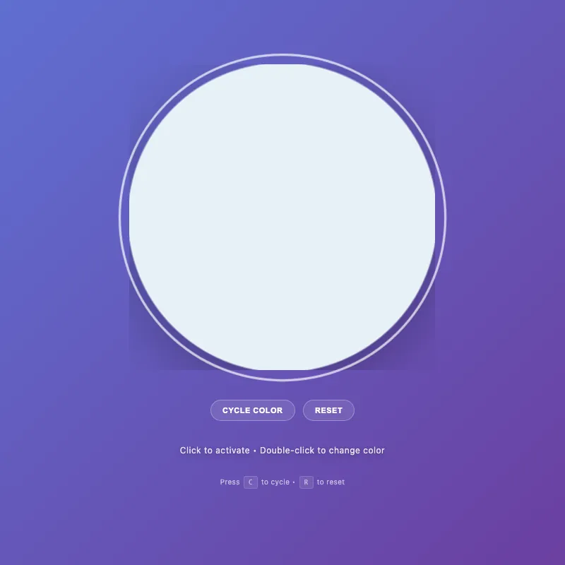
offline render, Chrome 154, light scheme, 2 s of virtual time
This page calls Math.random or the clock, so a live run can differ from this render.
runs in a sandboxed frame with no origin; live pages may fetch CDN fonts the offline render did not
<!DOCTYPE html>
<html lang="en">
<head>
  <meta charset="UTF-8">
  <meta name="viewport" content="width=device-width, initial-scale=1.0">
  <title>Circle Display</title>
  <style>
    :root {
      --color-white: #ffffff;
      --color-gold: #ffd700;
      --color-pink: #ff6b9d;
      --color-teal: #4ecdc4;
      --color-mint: #95e1d3;
      --shadow-color: rgba(0, 0, 0, 0.3);
      --transition-normal: 0.3s ease;
      --transition-slow: 0.6s ease-out;
      --color-mode-1-rgb: 255, 107, 157;
      --color-mode-2-rgb: 78, 205, 196;
      --color-mode-3-rgb: 149, 225, 211;
    }

    * {
      margin: 0;
      padding: 0;
      box-sizing: border-box;
    }
    html {
      scroll-behavior: smooth;
    }
    html, body {
      width: 100%;
      height: 100%;
      overflow: hidden;
    }
    body {
      display: flex;
      flex-direction: column;
      justify-content: center;
      align-items: center;
      gap: 20px;
      background: linear-gradient(135deg, #5f6fd1 0%, #6b3fa0 100%);
      font-family: -apple-system, BlinkMacSystemFont, "Segoe UI", Roboto, sans-serif;
      color: var(--color-white);
      font-size: 14px;
      padding: 20px;
      min-height: 100vh;
    }
    .circle-container {
      cursor: pointer;
      border: none;
      background: none;
      padding: 0;
      position: relative;
      will-change: transform;
    }
    .circle-container:hover {
      transform: scale(1.06);
    }
    .circle-container:focus {
      outline: none;
    }
    .circle-container:focus-visible {
      transform: scale(1.08);
      outline: 3px solid rgba(255, 255, 255, 0.7);
      outline-offset: 12px;
      border-radius: 50%;
    }
    svg {
      width: min(400px, 80vw);
      height: min(400px, 80vw);
      display: block;
      animation: fadeIn var(--transition-slow);
    }
    circle {
      fill: var(--color-white);
      stroke: rgba(255, 255, 255, 0.2);
      stroke-width: 2;
      animation: pulse 3s ease-in-out infinite;
      filter: drop-shadow(0 20px 40px var(--shadow-color));
      transition: fill 0.3s ease, r 0.3s ease, stroke 0.3s ease, filter 0.3s ease;
      will-change: r, fill, filter;
    }
    .circle-container:is(:hover, :focus-visible) circle {
      fill: #e8f4f8;
      r: 205;
      stroke: rgba(255, 255, 255, 0.4);
    }
    .circle-container.active circle {
      fill: var(--color-gold);
      stroke: rgba(255, 215, 0, 0.3);
      animation: pulse-active 0.6s ease-in-out;
      filter: drop-shadow(0 20px 40px rgba(255, 215, 0, 0.5));
      r: 200;
    }

    [class*="color-mode-"] circle {
      fill: var(--mode-color);
      stroke: rgba(var(--mode-rgb), 0.3);
      filter: drop-shadow(0 20px 40px rgba(var(--mode-rgb), 0.3));
    }
    [class*="color-mode-"]:is(:hover, :focus-visible) circle {
      stroke: rgba(var(--mode-rgb), 0.5);
    }
    [class*="color-mode-"].active circle {
      filter: drop-shadow(0 20px 40px rgba(var(--mode-rgb), 0.5));
    }

    .circle-container.color-mode-1 { --mode-color: var(--color-pink); --mode-rgb: var(--color-mode-1-rgb); }
    .circle-container.color-mode-2 { --mode-color: var(--color-teal); --mode-rgb: var(--color-mode-2-rgb); }
    .circle-container.color-mode-3 { --mode-color: var(--color-mint); --mode-rgb: var(--color-mode-3-rgb); }

    .hint {
      font-size: 12px;
      opacity: 0.85;
      transition: opacity var(--transition-normal);
      letter-spacing: 0.5px;
      max-width: 85%;
      line-height: 1.6;
      margin-top: 12px;
      position: relative;
      text-shadow: 0 2px 8px rgba(0, 0, 0, 0.4);
      will-change: opacity;
    }

    .mode-indicator {
      font-size: 10px;
      opacity: 0;
      margin-top: 8px;
      letter-spacing: 1px;
      text-transform: uppercase;
      transition: opacity var(--transition-normal);
      height: 16px;
    }
    .mode-indicator.visible {
      opacity: 0.9;
    }

    .controls {
      display: flex;
      gap: 12px;
      margin-top: 10px;
      flex-wrap: wrap;
      justify-content: center;
      width: 100%;
    }

    .control-btn {
      padding: 8px 16px;
      font-size: 11px;
      font-weight: 600;
      letter-spacing: 0.5px;
      text-transform: uppercase;
      background: rgba(255, 255, 255, 0.15);
      color: var(--color-white);
      border: 1px solid rgba(255, 255, 255, 0.3);
      border-radius: 20px;
      cursor: pointer;
      transition: background-color var(--transition-normal), border-color var(--transition-normal), transform var(--transition-normal), box-shadow var(--transition-normal);
      backdrop-filter: blur(4px);
      will-change: transform;
      outline: none;
    }

    .control-btn:hover {
      background: rgba(255, 255, 255, 0.25);
      border-color: rgba(255, 255, 255, 0.5);
      transform: translateY(-2px);
      box-shadow: 0 8px 16px rgba(0, 0, 0, 0.2);
    }

    .control-btn:active {
      transform: translateY(0) scale(0.98);
      box-shadow: 0 2px 4px rgba(0, 0, 0, 0.1);
    }

    .control-btn:focus-visible {
      outline: 2px solid rgba(255, 255, 255, 0.7);
      outline-offset: 4px;
    }
    .control-btn:disabled {
      opacity: 0.5;
      cursor: not-allowed;
    }
    @keyframes pulse {
      0%, 100% { r: 200; opacity: 0.95; }
      50% { r: 203; opacity: 1; }
    }
    @keyframes pulse-active {
      0% { r: 200; }
      50% { r: 210; }
      100% { r: 200; }
    }
    @keyframes fadeIn {
      from { opacity: 0; transform: scale(0.9); }
      to { opacity: 1; transform: scale(1); }
    }
    @keyframes colorShift {
      0% { filter: saturate(1) brightness(1); }
      50% { filter: saturate(1.3) brightness(1.1); }
      100% { filter: saturate(1) brightness(1); }
    }
    .color-shifting circle {
      animation: colorShift 0.5s cubic-bezier(0.34, 1.56, 0.64, 1);
      transform-origin: center;
    }
    .keyboard-hint {
      font-size: 10px;
      opacity: 0.6;
      margin-top: 6px;
      letter-spacing: 0.3px;
      transition: opacity var(--transition-normal);
    }
    .keyboard-hint kbd {
      background: rgba(255, 255, 255, 0.15);
      border: 1px solid rgba(255, 255, 255, 0.25);
      border-radius: 3px;
      padding: 2px 6px;
      font-family: 'Monaco', 'Courier New', monospace;
      font-size: 9px;
      font-weight: 500;
      display: inline-block;
      margin: 0 2px;
    }
    @media (pointer: coarse) {
      .keyboard-hint {
        display: none;
      }
    }
    main {
      display: flex;
      flex-direction: column;
      align-items: center;
      gap: 12px;
      text-align: center;
      width: 100%;
    }

    @media (max-width: 480px) {
      body {
        gap: 12px;
        padding: 16px;
      }
      svg {
        width: min(320px, 75vw);
        height: min(320px, 75vw);
      }
      .hint {
        font-size: 11px;
        max-width: 90%;
        margin-top: 10px;
      }
      .mode-indicator {
        font-size: 9px;
      }
      .control-btn {
        padding: 10px 18px;
        font-size: 10px;
        min-height: 44px;
        display: flex;
        align-items: center;
        justify-content: center;
      }
    }
    @media (max-width: 360px) {
      body {
        gap: 8px;
        padding: 12px;
      }
      svg {
        width: min(280px, 70vw);
        height: min(280px, 70vw);
      }
      .controls {
        flex-wrap: wrap;
      }
    }
    @media (prefers-reduced-motion: reduce) {
      * {
        animation: none !important;
        transition: none !important;
      }
    }
    @supports (backdrop-filter: blur(0)) {
      .control-btn {
        background: rgba(255, 255, 255, 0.1);
      }
    }
    @supports not (backdrop-filter: blur(0)) {
      .control-btn {
        background: rgba(0, 0, 0, 0.3);
      }
    }
  </style>
</head>
<body>
  <main>
    <button class="circle-container" id="decorative-circle" aria-label="Interactive circle - click to toggle" aria-pressed="false">
      <svg viewBox="0 0 400 400" width="400" height="400" aria-hidden="true" role="presentation">
        <circle cx="200" cy="200" r="200"/>
      </svg>
    </button>
    <div class="mode-indicator" id="mode-indicator" aria-live="polite" aria-atomic="true" aria-label="Current color mode"></div>
    <div class="controls" role="group" aria-label="Circle controls">
      <button class="control-btn" id="cycle-btn" aria-label="Cycle to next color">Cycle Color</button>
      <button class="control-btn" id="reset-btn" aria-label="Reset to default state">Reset</button>
    </div>
  </main>
  <div class="hint" id="hint-text" role="status" aria-live="polite" aria-relevant="text">Click to activate • Double-click to change color</div>
  <div class="keyboard-hint" aria-label="Keyboard shortcuts: Space or Enter to toggle, C to cycle color, R to reset">Press <kbd>C</kbd> to cycle • <kbd>R</kbd> to reset</div>

  <script>
    const CONFIG = {
      storageKey: 'circle-state',
      tapDelay: 300,
      colorShiftDuration: 500,
      colorModes: [
        { class: 'default', name: 'Default White' },
        { class: 'color-mode-1', name: 'Pink' },
        { class: 'color-mode-2', name: 'Teal' },
        { class: 'color-mode-3', name: 'Mint' }
      ],
      isTouch: 'ontouchstart' in window || navigator.maxTouchPoints > 0
    };

    const el = {
      circle: document.getElementById('decorative-circle'),
      hint: document.getElementById('hint-text'),
      modeIndicator: document.getElementById('mode-indicator'),
      cycleBtn: document.getElementById('cycle-btn'),
      resetBtn: document.getElementById('reset-btn')
    };

    let state = { active: false, colorMode: 0 };
    let lastTapTime = 0;
    let tapTimeout = null;

    const getColorModeClass = (mode) => CONFIG.colorModes[mode].class;
    const getColorModeName = (mode) => CONFIG.colorModes[mode].name;

    const storage = {
      save() {
        try {
          localStorage.setItem(CONFIG.storageKey, JSON.stringify(state));
        } catch {
          // Silently fail if localStorage is unavailable or quota exceeded
        }
      },
      load() {
        try {
          const saved = localStorage.getItem(CONFIG.storageKey);
          if (saved) {
            const parsed = JSON.parse(saved);
            if (parsed && typeof parsed === 'object') {
              state = { ...state, ...parsed };
            }
          }
        } catch {
          // Silently fail if parsing fails
        }
      }
    };

    const updateClasses = () => {
      const colorClasses = CONFIG.colorModes.map(m => m.class);
      el.circle.classList.remove('active', ...colorClasses);
      el.circle.setAttribute('aria-pressed', state.active);
      if (state.active) el.circle.classList.add('active');
      if (state.colorMode > 0) el.circle.classList.add(getColorModeClass(state.colorMode));
    };

    const updateUI = () => {
      const mainText = state.active ? 'Active!' : 'Click to activate';
      let hintParts = [mainText];

      if (CONFIG.isTouch) {
        hintParts.push(state.active ? 'Tap to change color' : 'Tap twice to change color');
      } else {
        hintParts.push('Double-click to change color');
      }

      el.hint.textContent = hintParts.join(' • ');

      const showMode = state.active && state.colorMode > 0;
      el.modeIndicator.classList.toggle('visible', showMode);
      if (showMode) {
        const modeName = getColorModeName(state.colorMode);
        el.modeIndicator.textContent = modeName;
      }
    };

    const applyState = () => {
      updateClasses();
      updateUI();
    };

    const toggleActive = () => {
      state.active = !state.active;
      applyState();
      storage.save();
    };

    const cycleColor = () => {
      state.colorMode = (state.colorMode + 1) % CONFIG.colorModes.length;
      state.active = true;
      el.circle.classList.add('color-shifting');
      setTimeout(() => el.circle.classList.remove('color-shifting'), CONFIG.colorShiftDuration);
      applyState();
      storage.save();
    };

    const resetState = () => {
      state = { active: false, colorMode: 0 };
      applyState();
      storage.save();
    };

    const handleDblClick = (e) => {
      e.preventDefault();
      cycleColor();
    };

    const handleTouchEnd = (e) => {
      const now = Date.now();
      if (now - lastTapTime < CONFIG.tapDelay && lastTapTime > 0) {
        cycleColor();
        lastTapTime = 0;
        clearTimeout(tapTimeout);
      } else {
        lastTapTime = now;
        clearTimeout(tapTimeout);
        tapTimeout = setTimeout(() => { lastTapTime = 0; }, CONFIG.tapDelay);
      }
    };

    const keyHandlers = {
      ' ': toggleActive,
      'enter': toggleActive,
      'c': cycleColor,
      'r': resetState
    };

    const handleKeyDown = (e) => {
      const handler = keyHandlers[e.key.toLowerCase()];
      if (handler) {
        e.preventDefault();
        handler();
      }
    };

    const initListeners = () => {
      el.circle.addEventListener('click', toggleActive);
      el.circle.addEventListener('dblclick', handleDblClick);
      el.circle.addEventListener('touchend', handleTouchEnd);
      el.circle.addEventListener('blur', () => {
        lastTapTime = 0;
        clearTimeout(tapTimeout);
      });
      document.addEventListener('keydown', handleKeyDown);
      el.cycleBtn.addEventListener('click', cycleColor);
      el.resetBtn.addEventListener('click', resetState);
    };

    const initApp = () => {
      storage.load();
      applyState();
      initListeners();
      requestAnimationFrame(() => el.circle.focus());
    };

    if (document.readyState === 'loading') {
      document.addEventListener('DOMContentLoaded', initApp);
    } else {
      initApp();
    }
  </script>
</body>
</html>
what changed from step 018
+39 / -5 lines
box-sizing: border-box; }+ html {+ scroll-behavior: smooth;+ } html, body { width: 100%;⋯ line 112 .hint { font-size: 12px;- opacity: 0.75;+ opacity: 0.85; transition: opacity var(--transition-normal); letter-spacing: 0.5px;⋯ line 119 margin-top: 12px; position: relative;- text-shadow: 0 2px 4px rgba(0, 0, 0, 0.2);+ text-shadow: 0 2px 8px rgba(0, 0, 0, 0.4); will-change: opacity; }⋯ line 201 } .color-shifting circle {- animation: colorShift 0.5s cubic-bezier(0.34, 1.56, 0.64, 1) !important;+ animation: colorShift 0.5s cubic-bezier(0.34, 1.56, 0.64, 1); transform-origin: center; }+ .keyboard-hint {+ font-size: 10px;+ opacity: 0.6;+ margin-top: 6px;+ letter-spacing: 0.3px;+ transition: opacity var(--transition-normal);+ }+ .keyboard-hint kbd {+ background: rgba(255, 255, 255, 0.15);+ border: 1px solid rgba(255, 255, 255, 0.25);+ border-radius: 3px;+ padding: 2px 6px;+ font-family: 'Monaco', 'Courier New', monospace;+ font-size: 9px;+ font-weight: 500;+ display: inline-block;+ margin: 0 2px;+ }+ @media (pointer: coarse) {+ .keyboard-hint {+ display: none;+ }+ } main { display: flex;⋯ line 307 </main> <div class="hint" id="hint-text" role="status" aria-live="polite" aria-relevant="text">Click to activate • Double-click to change color</div>+ <div class="keyboard-hint" aria-label="Keyboard shortcuts: Space or Enter to toggle, C to cycle color, R to reset">Press <kbd>C</kbd> to cycle • <kbd>R</kbd> to reset</div> <script>⋯ line 333 let state = { active: false, colorMode: 0 }; let lastTapTime = 0;+ let tapTimeout = null; const getColorModeClass = (mode) => CONFIG.colorModes[mode].class;⋯ line 376 hintParts.push(state.active ? 'Tap to change color' : 'Tap twice to change color'); } else {- hintParts.push('Double-click to change color • Press C or R for shortcuts');+ hintParts.push('Double-click to change color'); } ⋯ line 425 cycleColor(); lastTapTime = 0;+ clearTimeout(tapTimeout); } else { lastTapTime = now;+ clearTimeout(tapTimeout);+ tapTimeout = setTimeout(() => { lastTapTime = 0; }, CONFIG.tapDelay); } };⋯ line 452 el.circle.addEventListener('dblclick', handleDblClick); el.circle.addEventListener('touchend', handleTouchEnd);- el.circle.addEventListener('blur', () => { lastTapTime = 0; });+ el.circle.addEventListener('blur', () => {+ lastTapTime = 0;+ clearTimeout(tapTimeout);+ }); document.addEventListener('keydown', handleKeyDown); el.cycleBtn.addEventListener('click', cycleColor);
What the model said
Done! I've made several improvements to your interactive circle display:

## Key Improvements Made:

1. **Enhanced Text Visibility** — Increased hint text opacity and strengthened the text shadow for better readability against the gradient background

2. **Keyboard Shortcuts Display** — Added a dedicated keyboard hint section (`Press C to cycle • R to reset`) with styled keys that only appears on non-touch devices using `@media (pointer: coarse)`. This makes keyboard shortcuts discoverable without cluttering the main hint

3. **More Reliable Touch Detection** — Improved the double-tap handling by:
   - Adding proper timeout management to clear pending taps
   - Clearing timeouts on blur events for cleaner state management
   - Making the tap detection more robust overall

4. **Cleaner UX Text** — Separated keyboard shortcuts into a distinct element so the main hint focuses on the interaction mode relevant to the device type

5. **Code Cleanup** — Removed an unnecessary `!important` flag from the animation rule, letting normal CSS specificity rules apply

The improvements maintain the original design and functionality while making the interface more intuitive and the code more maintainable. The keyboard hints are intelligently hidden on touchscreen devices using modern CSS media queries.